How to Harmonize Your Kitchen Cabinet Colors
Choosing the perfect cabinets for your kitchen is only part of the picture; the other half is what color those cabinets will have as a “backdrop.” In order to balance kitchen ingredients so that one element doesn’t overwhelm the others, think about complements and contrasts in color. At Diamond Kitchen and Bath we help you with all of these big choices. Here are some things our kitchen design experts advise when looking at the big color picture:
WOOD AND SUNSHINE
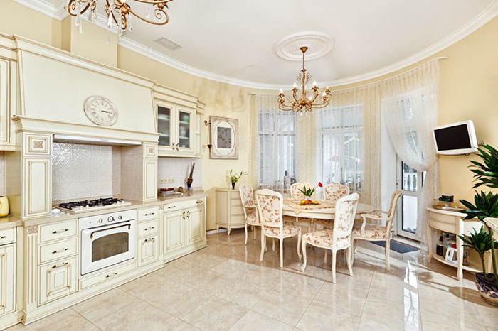
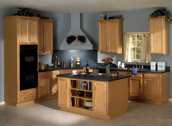
Wood cabinetry is still the number one choice of kitchen planners and their customers, for good reason. There’s so much variety to this beautiful natural material that it can go seamlessly from modern minimalist to country kitsch with warmth and elegance. That means it also offers you a tremendous variety of potential color matches and contrasts as well. In order to make brown or golden-hued cabinets such as oak, birch, maple, or walnut gleam — especially if they’re finished with a light hand that allows the grain to show — you can go one of two ways: contrast or complementarity.
In contrast, white is both neutral and bright, a unique entity in itself. Other colors that will make your warm wood tones “pop” are vivid hues such as aquamarine, teal, navy, grass green, cranberry, terra-cotta, and true reds such as cherry and scarlet. For complementarity, harmonize your cabinet’s natural glow with buttercup yellow, pale peach, or cream walls and add trim in more intense versions of those such as orange, lemon, or wine. Deep-toned walls will shrink a room, while lighter tones expand it — something to remember if you’re dealing with a very small kitchen or darker-toned woods such as mahogany or ebony.
HANDLE WITH CARE
Cherry wood, undeniably popular in kitchens, can have a tricky side to it when it comes to choosing what colors surround it. Shades that are too bright or have too much red already in them will “fight with” the cherry finish, blur its unique character, or make your kitchen feel too “active.” You’ll probably want to avoid carnation, salmon, and burgundies (even pastel) for that reason. Instead, think in terms of cooler, greener shades, such as sage, olive, dove gray, or a silvery blue. You’ll often see cherry cabinetry with stainless steel appliances; in these spaces, metallic paint in similar blues, grays, or greens can emphasize that shine.
FITTING THE PARTS TOGETHER
It’s important to remember that wall paint colors need to coordinate with more than just the cabinet fronts or sides as well. Backsplashes, countertops, and fixtures all play a role in the ambiance of your kitchen —and since those elements are permanent in nature, your wall paint needs to “work” with all of them well. This is the reason you’ll often see designers go for a wall color that echoes a vein in the granite countertop, plays off a burnished copper fixture, or matches part of a printed tile.
Truly effective color “matches” in these cases aren’t exact but familial: a grapey purple backsplash with lavender…a deep wood-grain accent with sandalwood or beige…a silvery granite vein with palest pearl gray walls and white wainscoting. Staying within a given color family makes the space serene without being boring while playing small vivid touches against each other makes for lively energy. In that sense, ebony cabinetry can balance well with splashes of lemon, raspberry, or violet — in small doses.
Bouncing light off dark cabinets is easier with subtle, light-infused tones such as soft mocha, pale aqua, French vanilla, or seafoam. On the other hand, white kitchen cabinetry lends itself to almost any color palette you desire. White plus primaries make for a cheery, lighthearted space: red-and-white gingham is a traditional kitchen staple for good reason! Other beautiful shades with white are true blue and pure yellow, lime green, dusty rose, and even black — again, in small doses, such as bistro-style black-and-white tile. Just keep in mind that the best contrasts make the room seem cleaner, fresher, and brighter all at once!
SPIN THE WHEEL
As with any aspect of décor, coordinating colors for your kitchen is a matter of intelligent use of the color wheel — something with which a professional kitchen designer and consultant can help. At Diamond Kitchen and Bath, we love getting to work hand in hand with our clients, from the design process on paper to the final touches of installation. We have been working in the Arizona valley since 1986 and would love to help you find the right color and the right cabinet for your kitchen.